99 Maps to Save the Planet bills itself as a shocking but informative, eye-catching and witty book of maps that illustrate the perilous state of our planet.
Did you know that just 67 companies worldwide are responsible for 67 per cent of global greenhouse emissions? Or that keeping a horse has the same carbon footprint as a 23,500-kilometre road trip?
Here, wildlife TV presenter and conservationist Chris Packham, who guest-edited The Big Issue’s mammoth Earth Day special edition and wrote the foreword to the book, reveals how 99 Maps to Save the Planet can change the way you see the world.
Support The Big Issue and our vendors by signing up for a subscription.
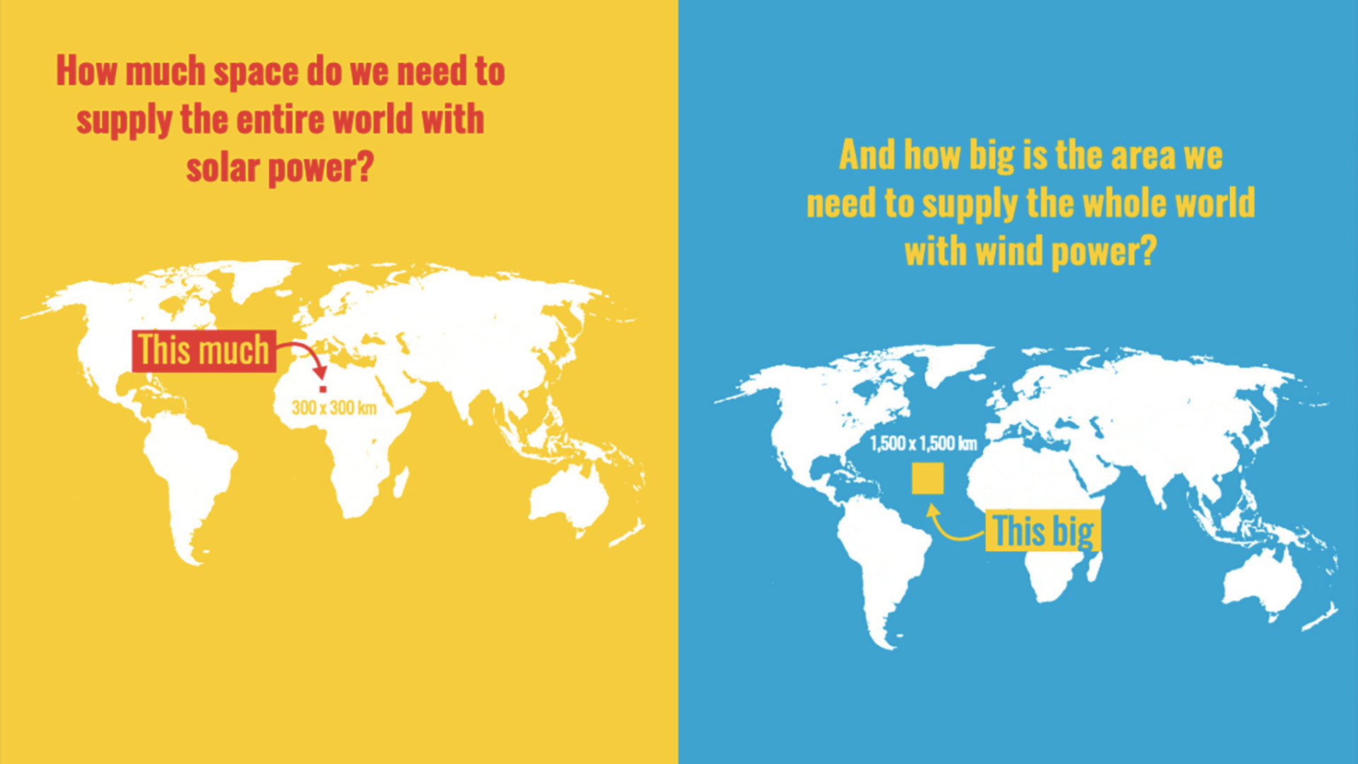
Terrifying yet funny, surprising yet predictable, simple yet poignant, occasionally abstract and yet so very, very important – this collection of infographics like the one above presents a telling picture of our planet at the beginning of the 21st century. There is both a ruthless clarity and beautiful precision in the design.
These maps work brilliantly because the premise behind each message is so straightforward, devoid of clutter or circuitous pernickety explanation.
They tell the truth: a truth we must confront to enable change. Indeed, they have been conceived to change our minds and they leave us with no doubt that without success in this regard we are doomed.


